Aggregation Charts and Drill-Down
An aggregation can be read as figures or as a chart. The chart is usually the better place to start, and it is the one you can click.
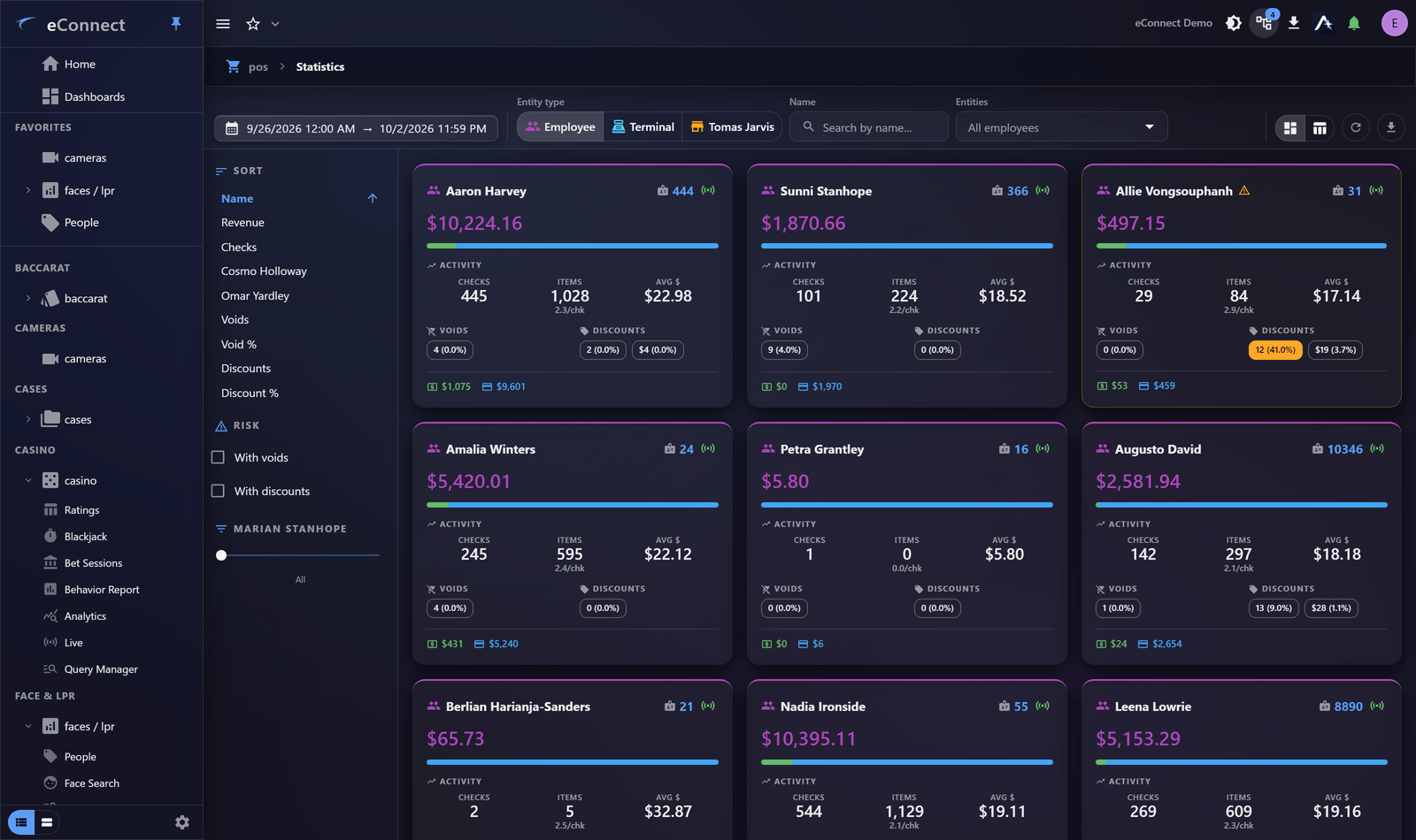
Switching to a chart
Use the chart toggle on the aggregation panel. Two shapes are offered:
| Chart | Best for |
|---|---|
| Bar chart | Comparing groups — which register, which hour, which detector |
| Pie chart | Proportions of a whole, with few enough slices to distinguish |
Bar is the safer default. A pie with more than about six slices is harder to read than the table it came from; a bar chart with twenty bars is still perfectly readable.
Reading it
A chart answers "which is biggest" faster than a column of figures. What you are looking for is usually the outlier — the register unlike the others, the hour that spikes, the detector reporting far more or far less than its neighbours.
Where a measure is money, the chart labels it as such, so you are not left guessing whether a figure is currency or a count.
Drilling down
Select a slice or a bar and you go to the rows behind it.
This is the movement worth learning above all others in eConnect. You are looking at a total, you want to know what made it, and one click gets you the records — already filtered to that group, with your original query still applied.
From there you can drill again: from the rows to a single record, from that record to its video or its history. Each step is captured in your Workspace, so the path from "something looks odd" to "here is why" is recorded as you walk it.
Coming back up
Use the breadcrumb, or your browser's back navigation, to return to the aggregate. The chart is as you left it — drilling in does not lose your position.
A worked pattern
The standard investigation shape, which works in every module:
- Query the period — a shift, a day, a week.
- Aggregate by something coarse — revenue centre, entrance, table.
- Chart it, and find the outlier.
- Drill into the outlier.
- Aggregate that by something finer — by employee, by hour.
- Drill again, into the records.
Each step narrows by an order of magnitude, so four steps take you from a week of data to the handful of records that explain it — without ever paging through a grid.
Keeping the finding
| To keep | Do |
|---|---|
| The question, to re-run | Save the query |
| The chart, to watch | Pin it to a dashboard |
| The path you took | It is already in your Workspace — pin the steps |
| The figures | Export |
When drill-down is unavailable
Some aggregations are computed in a way that has no single set of rows behind a group. Where that is the case the slice is not clickable — the figures are still correct, but the path back to records goes through the grid and a filter instead.