Event Themes
Event Themes are the colored overlays, icons, and messages that appear on Live Monitor detection cards. They turn what would otherwise be a uniform grid of faces into an at-a-glance operator dashboard where a green welcome stands out as clearly as a red alert.
Each theme is keyed to an EventClassification value on a detection. When a detection arrives with a classification that matches an enabled theme, that theme's styling takes over the card.
Classifications are set by your rules engine — typically Node-RED when Face Verify is part of the pipeline.
Where to Configure Themes
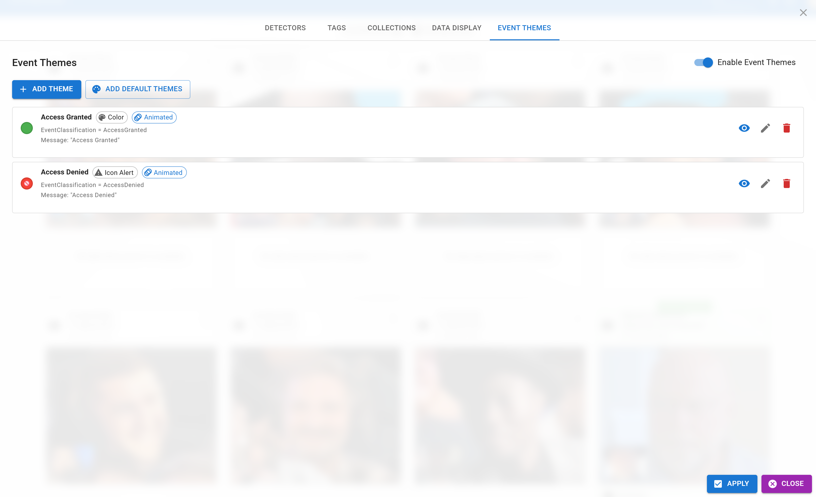
- Open the Live Monitor settings (gear icon).
- Go to the Event Themes tab of the filter dialog.
- Add, edit, enable, or remove themes from the list.
You can also toggle the entire theme system on or off from the top of the tab — useful when you want a plain feed without colored overlays.
The Three Theme Types
Every theme is one of three types. Pick based on how visually prominent the signal should be.
Theme Fields
All themes share a common set of fields, plus type-specific ones:
| Field | Type | Description |
|---|---|---|
| Name | all | Display name for the theme in the editor. Not shown on detection cards. |
| EventClassification Value | all | The classification string that triggers this theme. Must match exactly the value your rules engine sends (e.g. AccessGranted). |
| Message | all | Optional overlay text rendered on the card when the theme matches. |
| Enabled | all | Toggle to disable a theme without deleting it. |
| Animate | all | Toggle the pulse / animation effect. |
| Color | Color / Icon Alert | The accent color used for the gradient and border. |
| Icon | Icon Alert only | An emoji or Material icon name displayed prominently on the card. |
| Alert Font Size / Color Intensity | Icon Alert | Fine-tune how loud the alert looks. |
Default Themes
A set of sensible defaults ships with Live Monitor and serves as a template:
| Name | Classification | Type | Color | Icon | Message |
|---|---|---|---|---|---|
| Access Granted | AccessGranted | Color | Green | — | Access Granted |
| Access Denied | AccessDenied | Icon Alert | Red | 🚫 | Access Denied |
| Access Timeout | AccessTimeout | Color | Orange | — | Access Request Timed Out |
| Unauthorized | Unauthorized | Icon Alert | Pink | ⚠️ | Unauthorized Access Attempt |
| Entry | Entry | Festive | (rainbow) | ✨ | Welcome! |
| Exit | Exit | Color | Purple | — | Goodbye! |
Customize these or replace them entirely — the system matches by classification value, so any theme you add will take over once a classification arrives.
The Connection to Face Verify
Event Themes are the operator side of the red / green light that customers see on Face Verify kiosks.
Customer at kiosk  ─→  Detection sent to Identities  ─→  Rules engine returns EventClassification ─┬─→  Face Verify overlay color
                                                                                                   └─→  Live Monitor Event Theme
Because both ends use the same classification value, a green for the customer at the kiosk is a green for the operator at the security desk — no translation needed, no chance of desync.
The easiest way to stay consistent is to decide on the classification vocabulary once (e.g. AccessGranted, AccessDenied, WatchListMatch, NewVisitor) and use those exact values both in your Node-RED rules and in your theme configuration on every device.
Preview
The editor includes a preview area that shows how each theme will render before you apply it. Use this when authoring a new theme or fine-tuning an existing one — you don't have to wait for a live detection to see the result.